
Make the business name recognizable beyond one setting
Logo design for a West Valley City business should connect identity with everyday use. Galactic Digital Studios helps develop a visual direction around the name, audience, and applications that matter to your company. A mark should make the business easier to recognize without needing a different explanation each time it appears.
West Valley City belongs to the regional business network described by ChamberWest. If your company works across that west-side area, the identity may appear in many contexts before someone visits your premises. Consistency between a website, document, and physical application helps people connect those encounters.
Consider a hypothetical West Valley City field-service company. Its name might appear on an estimate, workwear, and a small profile image. Those formats place different demands on lettering and detail. The brief should identify them early rather than approve a large presentation mark and discover later that it becomes illegible in ordinary use.
Choose a clear idea instead of combining every idea
An effective identity brief explains the business and the qualities its customers should recognize. Describe what you do, who you serve, and what distinguishes the experience you can actually deliver. Avoid asking a single symbol to represent every service, geographic connection, and aspiration at once.
The relationship between the name and any symbol deserves particular attention. A long business name may need a carefully arranged wordmark. A compact symbol may support small applications, but customers still need a way to identify the company. Explore the whole naming presentation rather than judging an icon in isolation.
For an established business, identify which features carry recognition before changing them. A focused refinement can address reproduction or inconsistency while retaining familiar elements. For a new company, settle the name and intended audience before investing in detailed concepts. References should communicate useful qualities, such as legibility or proportion, rather than become instructions to imitate another company's identity.

Test the identity across a practical set of uses
Review the mark at small sizes and in the proportions where it will appear. A horizontal version may work in a website header, while a compact arrangement may suit another application. The versions should share the same recognizable core instead of feeling like separate identities.
Single-color and reversed artwork can reveal weaknesses hidden by a full-color mockup. Discuss physical production needs with the relevant vendor, especially when detail, material, or viewing distance affects reproduction. A proposed sign or workwear presentation helps explore the idea, but it does not establish that the item has been manufactured or installed.
Decide what the project includes beyond the mark. Color definitions, typography guidance, spacing examples, and supporting layouts are useful possibilities, but they need to be specified. Coordinate business graphics around the approved direction so the logo is applied consistently to material your team will actually distribute.

Use the brief to resolve feedback
Discovery gathers the business story, existing assets, intended audience, and applications. We discuss the character the identity should communicate and the constraints it must respect. Agree on who approves the direction and how comments will be consolidated before concept work begins.
Concept review should test fit, readability, and usefulness. If a design suggests the wrong kind of service, describe that mismatch. If the name loses clarity in a small application, identify where it fails. Practical feedback gives refinement a direction instead of turning the process into a sequence of unrelated preferences.
Refinement resolves the chosen idea through proportion, spacing, color, and agreed variants. Before handoff, review the final files against the deliverables and discuss their intended uses. Budget and timing depend on exploration, revisions, and the breadth of the identity system. Plan enough time for applying the result to active materials if a launch or business change has a fixed date.
Evaluate the system behind the presentation
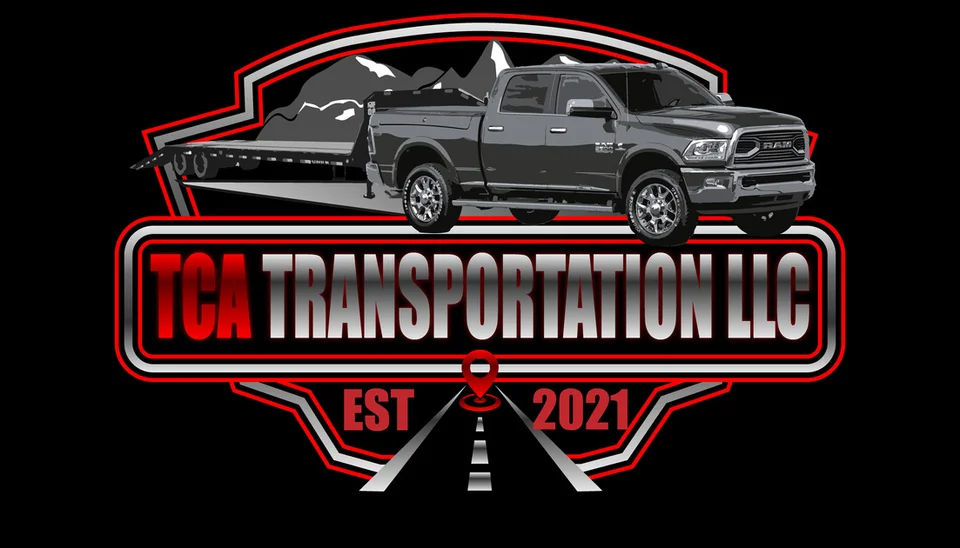
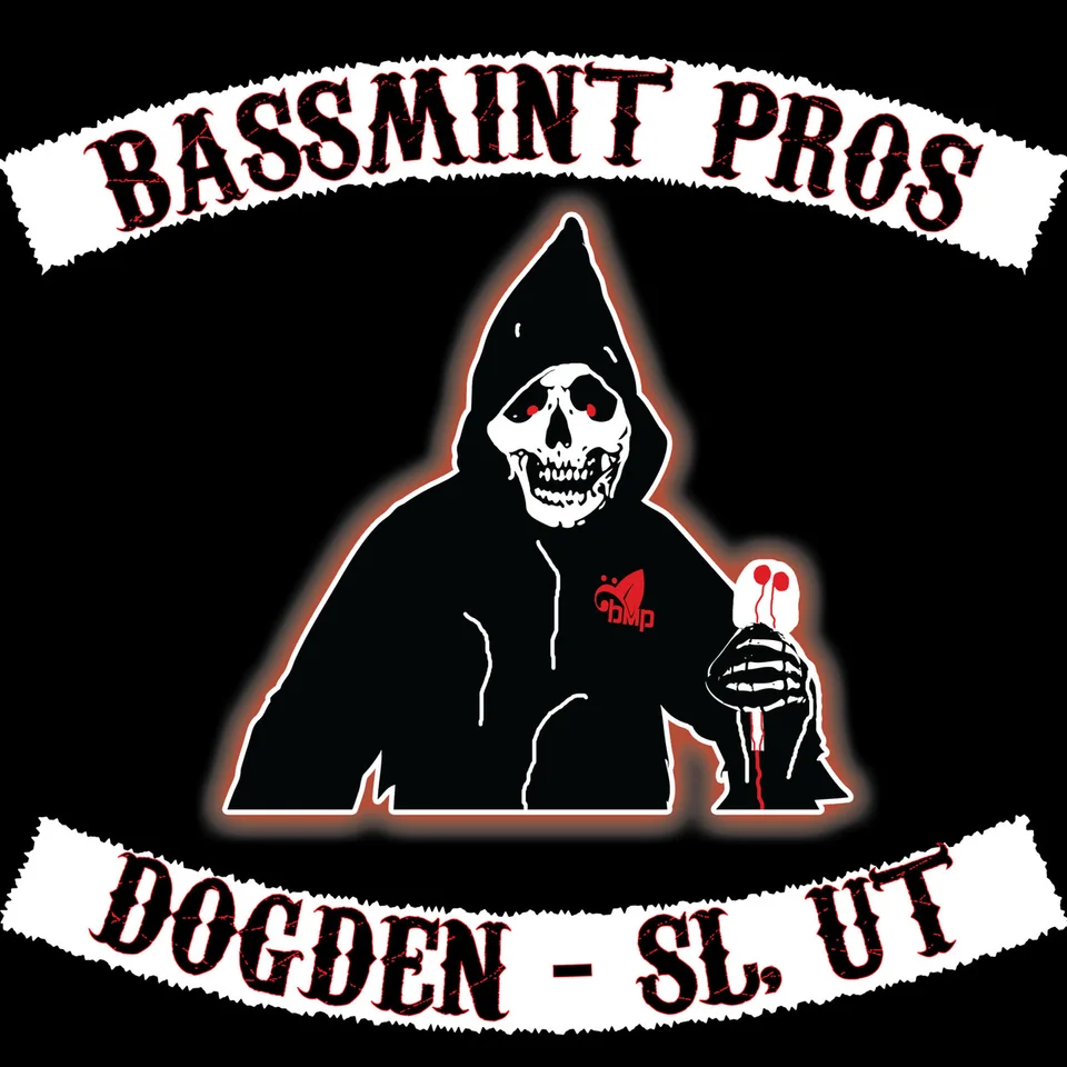
The identity examples here are existing Galactic portfolio work. They are not presented as West Valley City client projects. Look at how each balances a business name, visual character, and application. Different approaches can work for different audiences; a compelling example is a starting point for discussion rather than a universal style prescription.
Review the portfolio with your required applications in mind. Ask how a proposed concept will be tested and what files or guidance will be delivered. A polished presentation does not answer questions about ownership terms, third-party fonts, or name availability. Those should be clarified independently of visual approval.
Galactic collaborates remotely with West Valley City business owners, using the brief and organized feedback to guide the work. A coherent identity supports familiarity and credibility through repeated use. Customer experience, service quality, and ongoing communication still give the mark its meaning. A redesign alone cannot guarantee a stronger reputation or a particular sales result.

Keep the approved direction intact after delivery
Store approved files in a location the business controls and distinguish them clearly from exploratory concepts. Staff should not need to reconstruct the logo from a screenshot or guess which variation a vendor requires. Ask for an explanation of the delivered formats and their intended applications.
Discuss the terms for final artwork, editable source files, and any third-party components before handoff. A scalable master and everyday digital exports solve different needs. Clarify whether alternate arrangements, single-color versions, and basic usage guidance are included. More files are not automatically better if nobody knows how to use them.
For companies serving Taylorsville and Kearns alongside West Valley City, consistent identity use can connect regional communication. Those pages offer related service references. Plan updates to your own website, documents, and active physical materials in a sensible order so customers do not keep encountering conflicting versions of the same business.
Questions about logo design in West Valley City
Can you improve a familiar logo without replacing it completely?
A refinement may be appropriate when recognition is valuable but readability, file quality, or application is causing problems. Identify which features should remain and what practical issues need to be solved.
Does the logo need to include West Valley City imagery?
Only when that choice supports the business story and audience. Geographic symbols are optional. The business name, clarity, and practical applications provide a stronger basis for evaluating a direction than a requirement to depict a place.
How many concepts and revisions will we receive?
The proposal should define the exploration and review scope. The right approach depends on the brief and the amount of direction already established. Agree on decision makers and feedback arrangements before concepts begin.
Does visual approval establish trademark rights?
No. Name availability, protection, and ownership terms need separate attention. Do not assume legal clearance is included in a logo project or that a finished presentation establishes rights to a name or mark.
What helps vendors use the logo correctly?
Provide approved artwork in the appropriate format and any agreed color or spacing guidance. Confirm the vendor’s production specifications and avoid substituting low-quality screenshots for the delivered files.
A practical next step
Give recognition a consistent foundation.
Share the identity you have now, the audience you serve, and where the mark needs to appear. We can discuss a focused refinement or a new direction within our broader West Valley City web and design offering.
Plan your West Valley City project