
Choose an identity beyond the obvious place-name symbol
Black Diamond offers strong associations through its name and coal-mining history. Those references can inspire design, but a diamond shape or mining tool does not automatically identify your business. The first question is what customers should remember about the company itself: the name, character, and type of relationship it offers.
A distinctive logo needs enough relevance to feel appropriate and enough individuality to avoid blending into unrelated identities. For a business here, that may mean a thoughtful wordmark or abstract symbol rather than a literal local scene. Regional connection can also appear through color, imagery, and language elsewhere in the brand.
Galactic develops logo design for Black Diamond businesses by examining those choices alongside real applications. A mark should remain recognizable in ordinary use, including the places where it appears small, in one color, or without a carefully staged background. The useful identity is the one the team can apply consistently.
The city directs its history page to the Black Diamond Historical Society and Museum. That is a useful research starting point for understanding local references, not a source of ready-made commercial identity. Your company can express continuity through original lettering and proportions without adopting imagery that belongs to a specific institution.
Establish what recognition is worth keeping
Before replacing an existing mark, identify what customers recognize. The name may have value even if the files are poor. A familiar color or lettering style may remain appropriate while the surrounding materials need better organization. Redesign should respond to a specific problem rather than the age of the logo alone.
A broader change may be justified when the company has changed direction, the current mark is repeatedly confused with something else, or essential applications do not work. Describe those problems in concrete terms. Thin details that disappear on workwear and a long arrangement that fails in a website header require different solutions.
For a hypothetical established Black Diamond business, continuity could be more useful than a completely unfamiliar identity. For a new company, there may be more room to define a visual direction from scratch. Neither case has a universal answer; the brief should reflect the company’s history and plans rather than the city’s story alone.

Set the name and practical requirements before exploration
Confirm the exact name, spelling, and any descriptor that must accompany it. If a location or service tagline is optional, say so. Separating a flexible descriptor from the core mark can make the identity easier to use as the business adds services or communicates with a broader audience.
List the first applications: website header, proposal, social avatar, invoice, garment, or vehicle. Prioritize the ones the business actually uses. A design that looks convincing on an imaginary storefront may still fail on the small document heading that customers see every week. Practical constraints belong in the brief from the beginning.
Bring original files and explain any restrictions on existing elements. Creative comparison and visual research do not replace legal trademark clearance. If the name or mark needs legal review, arrange that with appropriate counsel. Avoid adopting public seals, developer identities, outdoor-equipment marks, or historical-company symbols as shortcuts to local recognition.

Create distinction through proportion, type, and form
Galactic turns the brief into a visual direction by considering the audience and intended character. A precise professional identity may rely on different proportions and typography than a warm retail identity. The choices should have a reason connected to the company rather than being assembled from a list of popular symbols.
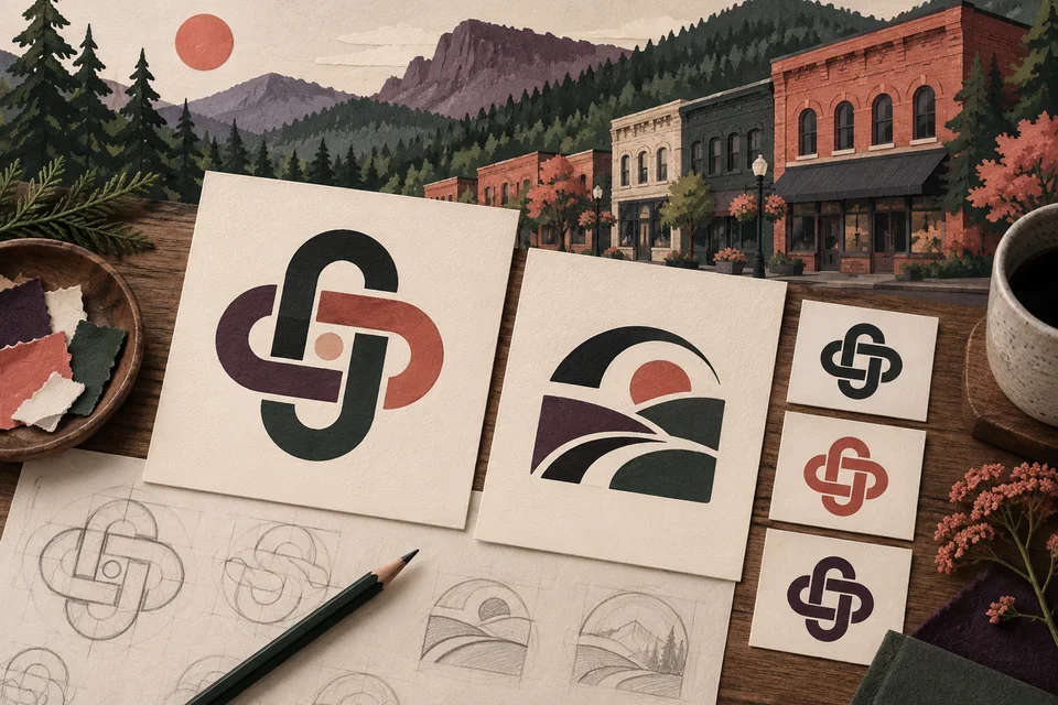
Black Diamond’s heritage can inform a sense of durability or craft without requiring crossed tools or an imitation historical badge. A restrained original form may communicate those qualities while remaining easier to reproduce. The conceptual artwork on this page illustrates exploration and is not a proposed identity for a real client.
We evaluate the direction in simple conditions before relying on presentation mockups. Removing texture, reducing size, and testing a one-color version can reveal whether the central idea holds together. Color and supporting graphics can enrich a sound mark, but they should not be required to rescue an unclear one.

Define the identity package by its applications
A complete handoff starts with an explicit file list. Discuss scalable vector artwork, common screen exports, approved color versions, and any alternate arrangements. A compact symbol may be helpful for an avatar, while a horizontal version may suit the website. Those are functional decisions, not reasons to create variations without a use.
Usage guidance can cover spacing, backgrounds, colors, and the limits of small reproduction. If typography is part of the system, explain any licensing responsibility. Editable files, approved rights, and exclusions should be addressed in the agreement so the owner understands what can be supplied to future vendors.
Cost and timing depend on exploration, the number of applications, review needs, and the depth of guidance. A logo project is not automatically a full campaign, website, or packaging system. Define the core identity first and identify related materials that need their own scope.
Make decisions against the brief rather than a popularity vote
Discovery documents the business direction and practical constraints. Concept exploration then tests different ways to express them. Reviewers should explain how a direction fits the intended audience and where it falls short. Combining favorite pieces from unrelated concepts can weaken the coherence that made each direction useful.
Refinement addresses spacing, proportions, letterforms, and reproduction. Test the chosen mark in the actual settings identified earlier. A specialized production vendor may need to confirm embroidery, fabrication, or print limits. A digital mockup helps visualize a use, but it cannot guarantee the quality of a physical result.
Before rollout, organize the approved assets and identify outdated versions in circulation. Update the most visible customer materials first and give staff a clear source for the current files. Keeping retired versions out of everyday folders helps prevent the identity from becoming inconsistent immediately after launch.

Judge portfolio identities by how clearly they function
Galactic’s identity portfolio provides existing work to examine for readability, balance, and consistent application. The examples shown are not Black Diamond client projects. Discuss which practical qualities you find useful, then relate them to your own name, audience, and reproduction needs rather than requesting a similar mark.
An identity can make a business easier to recognize, but trust comes from the experience behind it. A new logo cannot guarantee demand or correct an unclear service description. Pair visual consistency with accurate language and reliable customer follow-up so the business experience supports the identity.
Black Diamond graphic design can extend the approved mark into useful materials, while web development can carry it into a clear online introduction. Related Auburn and Kent service pages may help when the project spans a wider region, but the core identity should still reflect your own business.

Questions about logo design in Black Diamond
Does the logo need a diamond shape?
No. A literal place-name reference is optional. Choose a form that distinguishes the business and works in its applications rather than relying on the most obvious symbol.
Can the identity preserve an older look?
Yes, when that character fits the business and remains readable. Refinement can retain recognizable qualities while improving the details that limit everyday use.
Will we receive files for a printer?
Specify print and vendor needs during scoping. Scalable artwork and appropriate color versions are common requirements, but specialized production should be discussed explicitly.
Should the city name be inside the logo?
Include it only when it supports the long-term identity. A separate descriptor can provide local context while leaving the central mark flexible.
How should our team give feedback?
Choose decision-makers and compare each direction with the brief. Explain audience fit, readability, and application concerns so feedback can guide useful refinements.
Related services and nearby areas
Black Diamond web & design services · Black Diamond web development · Black Diamond graphic design · Auburn services · Kent services · Galactic portfolio
Plan your next step
Put clearer communication to work.
Give the business an identity it can use with confidence. Bring your current mark or new name, along with the applications that will matter first.
Discuss your Black Diamond project