
Create recognition that carries from screen to everyday use
Logo design for an Elk Plain business should help customers recognize the same company across a website, a printed document, and the materials they see later. Galactic Digital Studios develops identity directions with those ordinary uses in mind. The work connects a business's character to a mark that can be applied consistently.
Elk Plain's identity as a Pierce County community offers context without prescribing a visual formula. County Graham planning resources describe a broader setting with urban areas and valued rural character. That does not mean a local business needs a landscape, tree, or animal in its logo to belong here.
Begin with the impression your company needs to make. A service built around careful coordination may benefit from a different visual direction than one built around expressive personal work. The logo should reflect the business's own audience and offer, including people who may encounter it without knowing anything about Elk Plain.
Identify what customers already recognize
Before replacing an existing logo, separate familiar elements from practical problems. The name treatment may be memorable even if the file quality is poor. A color may provide continuity even if the symbol feels unrelated to the current business. Understanding that distinction helps decide between refinement and a broader redesign.
Collect ordinary examples of the identity in use. Website headers, estimates, presentation covers, and supplier-produced items can reveal where the current artwork fails. Perhaps a narrow space forces the name to become too small, or different staff members use incompatible versions. Those problems should shape the brief.
A new business has a different starting point. It needs to clarify its name, audience, and immediate applications before judging creative directions. Resolve important naming decisions early. Otherwise, the project may spend time refining artwork that must change when the underlying business identity is finally settled.

Build a useful family of arrangements
A single logo arrangement may not fit every application. A horizontal version can suit a website header, while a more compact version may fit a profile image or label. Decide which arrangements are genuinely needed and keep them related so customers experience one identity rather than several unrelated marks.
Test the name at realistic sizes. A symbol can look strong in a large presentation while the business name disappears in ordinary use. Review spacing, contrast, and the amount of detail that survives reduction. The smallest important application should inform refinement before the design is approved.
Color variations need a practical purpose too. A one-color version may be useful for simple printing or supplier requirements. Light and dark backgrounds may call for alternate treatments. These versions should preserve recognition without asking staff to improvise a new appearance whenever the original artwork is difficult to reproduce.
Give feedback through the business brief
We connect the creative direction to a brief that describes the audience, desired impression, and essential uses. References can help articulate qualities such as openness or precision, but they should not become instructions to copy another company's identity. The goal is a direction that belongs to your business.
When reviewing concepts, ask what each one communicates and how it behaves in your applications. A concern about legibility is different from a personal dislike of a color. Explain the business consequence of the concern so refinement can address the underlying issue instead of accumulating unrelated visual adjustments.
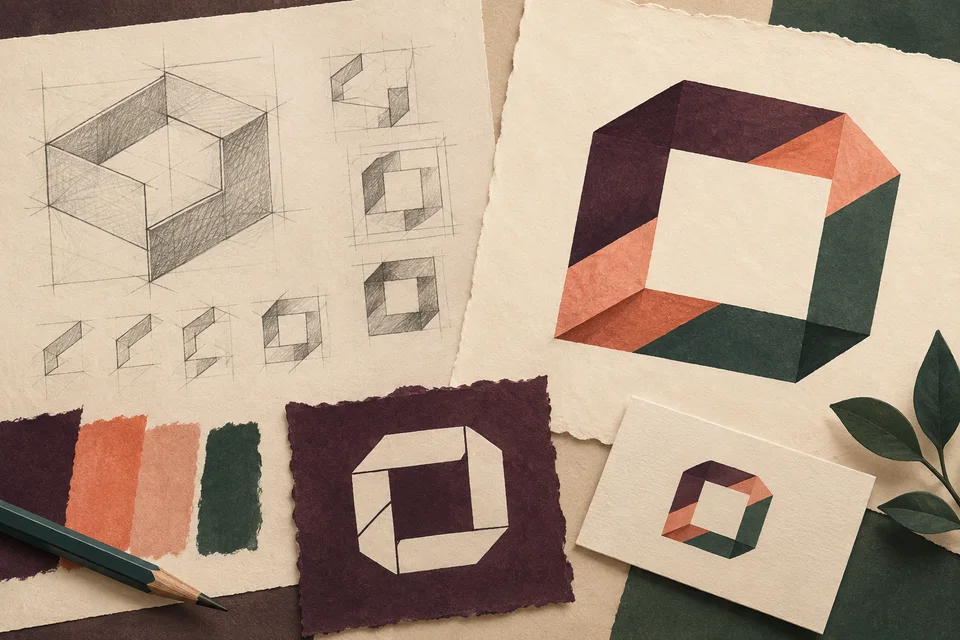
Local character can be subtle. A sense of openness or a restrained regional palette may be enough without depicting a specific place. The generated identity studies on this page are conceptual artwork, not a real Elk Plain brand. They illustrate the type of exploration that a project brief might inform, not a proposed logo ready for your adoption.
Let’s plan logo design around your Elk Plain customers’ next decision.
Make refinement visible in practical tests
A project can move through discovery, initial directions, a selected approach, and detailed refinement. Establish who makes the final decision and how other stakeholders contribute. One consolidated response helps keep the work connected to the brief rather than turning each review into a new set of competing instructions.
After selecting a direction, test spacing, proportions, and arrangements in the uses that matter most. Look at plain artwork as well as mockups. A presentation scene can help imagine an application, but it should not conceal details that fail when the mark appears on an ordinary white document.
Before final delivery, verify the spelling, approved colors, and versions included in the project. Discuss file naming and usage guidance so a team member can choose the right asset without guessing. Good handoff reduces the chance that someone will stretch the logo or send a low-resolution preview to a production supplier.

Treat the rollout as part of the planning conversation
Logo scope depends on the depth of exploration, the complexity of the identity, required variations, and supporting guidance. A logo project is different from a full system of document templates, signage, and website layouts. List the immediate applications and decide which additional work belongs in a later phase.
Discuss scalable vector files, screen-ready images, source-file delivery, and usage terms before approval. Fonts or other licensed components may have separate conditions. Creative review also does not establish legal clearance for a business name or trademark. Unresolved naming questions should be addressed before investing in a final production set.
Map the transition from old to new materials. Digital assets may be easy to replace while printed stock and physical items take longer. A staged rollout can be reasonable when it is deliberate. Staff should know which version is current and how the new identity relates to familiar elements customers already recognize.

Judge the mark without the surrounding presentation
Explore Galactic's portfolio to discuss identity choices and their application. Look for legible name treatments, consistent relationships, and a direction that remains recognizable in different settings. The existing portfolio examples shown here represent broader studio work rather than claimed Elk Plain clients.
For your own project, ask why a concept fits the brief and how it performs in the agreed tests. A logo can support recognition, but credibility also depends on service and communication. Consistent use over time matters more than an elaborate mockup or an unsupported promise that a new mark will generate business growth.
Questions about logo design in Elk Plain
Should the logo include an elk?
Only if that idea has a useful connection to the business and audience. A literal reference to the community name can become limiting or generic. Consider whether typography or another concept would distinguish the business more effectively.
Can we preserve our current colors?
Yes, when they remain useful and recognizable. The project can examine how those colors work with refined artwork and practical applications. A redesign does not require changing every familiar element simply to make the result look new.
How many logo versions do we need?
Start with the actual uses rather than an arbitrary number. A main arrangement, compact option, and necessary color variations may be appropriate. The agreed scope should explain the purpose of each version and the files delivered.
Does the project include customer document templates?
Only if those applications are part of the scope. Logo design establishes identity assets; a document template also needs content hierarchy and layout work. Discuss the rollout so related graphic and web projects can use the approved system.
What makes feedback useful during refinement?
Connect comments to the brief and a real application. Explain where recognition, readability, or fit breaks down. Consolidated feedback from the business helps resolve differences and gives the next revision a clear purpose.
Connect the next part of your project
Elk Plain web & design services · Elk Plain web development · Elk Plain graphic design · Explore the Galactic portfolio · Browse all service areas · Design services in Spanaway · Design services in South Hill
Plan your next step
Give your business a useful next step
Share the identity you use now and the places it needs to work next. We can plan an Elk Plain logo project around recognizable character and practical everyday use.
Discuss your Elk Plain project