

Express the business’s character with a mark people can recognize
Logo design for a Fircrest business should give the company a clear visual identifier across the places customers encounter it. Galactic Digital Studios develops directions around audience, character, and practical applications. The logo should support recognition while the surrounding message explains the service and its value.
Fircrest's history describes a carefully planned residential community with curved streets and a park-like character. Those qualities can inspire a conversation about rhythm or approachability, but they do not require every local business to use the same imagery. An identity needs a reason to fit your company specifically.
A hypothetical professional practice might need a precise, calm name treatment. A hypothetical creative service might benefit from a more expressive symbol. Neither needs to borrow a civic seal or a familiar landscape to feel connected to the place it serves. These examples illustrate possible briefs rather than actual local client work.
Define the identity problem before choosing a visual direction
An existing logo may be recognizable but difficult to reproduce. It may have too much detail for a small screen or lack usable files for suppliers. Those issues differ from a business that has changed its name, audience, or offer. The appropriate scope depends on which problem you are trying to solve.
Review what customers already know. A familiar color or name arrangement may be worth keeping even when the artwork needs refinement. Preserving useful recognition can make an update easier to apply and explain. A complete redesign should have a business purpose beyond the desire for a different appearance.
Collect real applications before the project begins. A website header, proposal cover, profile image, and small printed item can reveal limitations that are invisible in a large logo file. Use those examples to define the requirements and distinguish essential improvements from optional extensions.

Balance distinctive form with practical reproduction
A mark needs enough character to be recognizable and enough simplicity to work in ordinary use. Evaluate the name at small sizes, the relationship between symbol and lettering, and the amount of detail that survives reduction. A design should not depend on an elaborate presentation scene to remain legible.
Discuss arrangements for the spaces the business actually uses. A horizontal version may suit a website, while a compact arrangement may fit a label or profile image. These versions should form a related system, with clear guidance about when to use each one.
Color is part of the identity, but it should not be the only source of recognition. Review one-color use and light or dark backgrounds. Supplier requirements may call for specific formats or treatments. Testing those conditions early helps avoid approving artwork that later needs an improvised substitute for a common application.
Use the brief to evaluate concepts and feedback
The brief should describe the offer, audience, intended impression, and essential applications. References are useful for identifying qualities such as warmth, precision, or openness. They should support a discussion of direction rather than become instructions to reproduce another organization's identity.
We can explain how a concept addresses the brief and show it in relevant uses. Reviewers should ask whether the name reads clearly, whether the impression fits the service, and whether the mark remains identifiable without decoration. These questions make feedback more useful than a vote on favorite colors alone.
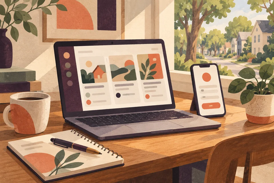
Local character can enter through proportion or a restrained visual rhythm. The curved geometric studies on this page are conceptual examples, not a finished Fircrest client identity. Your own mark should arise from your business brief and should not imply civic, club, recreational, or other institutional affiliation that has not been established.

Let’s plan logo design around your Fircrest customers’ next decision.
Refine the selected direction through realistic applications
A logo project can move from discovery to initial directions, focused selection, refinement, and final delivery. Agree on the decision-maker and feedback process at the beginning. One consolidated response helps the designer address a coherent set of priorities instead of responding to unrelated requests from several reviewers.
After a direction is selected, refine spacing, proportions, and relationships between the name and symbol. Test the necessary variations at their intended sizes. Compare the plain artwork with application mockups so the presentation helps evaluate the mark rather than concealing its limitations.
Before delivery, confirm spelling, approved colors, arrangements, and file requirements. Discuss naming conventions and proportionate usage guidance. Staff and suppliers should be able to choose an appropriate file without reconstructing the logo from a screenshot or guessing how the artwork should be adapted.

Define the deliverables and the transition together
Scope depends on creative exploration, complexity, required variations, and supporting guidance. A focused logo engagement is different from a full identity rollout across documents, signage, and a website. Identify immediate needs and later priorities so the proposal includes the work the business plans to use.
Confirm scalable vector artwork, suitable screen images, source-file arrangements, and usage terms. Fonts or licensed components may involve separate conditions. Creative review does not establish legal clearance for a name or trademark, so unresolved naming questions should be addressed before final artwork and physical production.
A practical rollout lists the places the old identity appears and the order in which they will change. Digital updates may be quick, while printed stock and supplier-produced items take longer. A planned transition can preserve familiarity and give staff a clear approved set to use as the new identity becomes established.

Look at how the identity performs outside the mockup
Galactic's portfolio provides existing work to discuss when evaluating identity craft and fit. Look for legibility, proportion, and consistent application. Ask how those decisions relate to your own requirements. The examples shown here are broader studio work, not claimed Fircrest projects.
For your project, evaluate the explanation behind a direction and the evidence from practical tests. A logo can support recognition and credibility, but trust also depends on service and communication. Consistent use over time matters more than a dramatic presentation or an unsupported promise of business growth from new artwork alone.
Questions about logo design in Fircrest
Does a Fircrest logo need a fir tree?
No. A tree reference is useful only when it supports the business and its audience. Typography or an abstract concept may provide stronger distinction. Local context can inform the brief without prescribing the symbol.
Can we refine the existing logo instead of replacing it?
Yes. Identify what is recognizable and what fails in practice. A refinement can improve spacing, reproduction, or file quality while preserving continuity. The scope should distinguish that work from a broader repositioning.
Which applications should we test first?
Start with the smallest and most common uses, then include any demanding production requirements. A website header and ordinary document often reveal issues that a large mockup hides. Supplier constraints should be discussed before approval.
Will the project include marketing materials?
Only if those applications are in the agreed scope. A logo system supplies identity assets, while a proposal, brochure, or website also requires content and layout decisions. Plan the related work around the approved direction.
What helps several owners agree on a concept?
Use the brief and realistic applications as the shared reference. Explain concerns in terms of readability, fit, or recognition, and consolidate feedback into one response. A clear decision process helps refinement move forward productively.
Connect the next part of your project
Fircrest web & design services · Fircrest web development · Fircrest graphic design · Explore the Galactic portfolio · Browse all service areas · Design services in Tacoma · Design services in Lakewood
Plan your next step
Give your business a useful next step
Bring your current identity and the applications that matter to your customers. We can plan Fircrest logo design around distinctive character, practical use, and a coordinated rollout.
Discuss your Fircrest project