

Express a connection to place without losing the business
Burley is a Census designated place associated with South Kitsap, while Burley Lagoon extends across Kitsap and Pierce county context. Those geographic references can influence a visual direction, but they do not define what a particular company does. A logo should identify the business before it asks the audience to interpret a local scene.
An inlet curve, wooded palette, or regional atmosphere may be appropriate for some companies. Others may benefit from typography or an abstract form with no literal landscape reference. Local relevance can also appear in the surrounding language and imagery, leaving the central mark free to work in small, practical settings.
Galactic develops Burley logo design from the business name, audience, character, and applications. We consider whether the identity needs a new direction, a refinement, or a better set of usable files. The result should remain recognizable when it appears beyond the immediate community as well as within it.
Identify the problem before replacing the familiar mark
A logo that looks poor in a document may have been exported badly rather than designed badly. Inconsistent colors may reflect missing guidance. A detailed symbol may need simplification for small uses. Diagnose the actual failure before deciding that the whole identity needs to change.
If customers already recognize useful elements, consider what should remain. A familiar name treatment or proportion can sometimes be preserved while the difficult details improve. A broader redesign may make sense when the business has changed direction or the current mark consistently suggests the wrong kind of service.
For a hypothetical Burley provider reaching a wider regional audience, an overly specific location line might be the main limitation. Separating that line from the permanent mark could provide flexibility without discarding recognition. These are possible design decisions, not claims about local client projects or fixed packages.

List the uses that will test the identity
Confirm the exact name and any required descriptor before detailed exploration. Decide whether the location belongs inside the mark or in supporting copy. Then list priority applications: website header, service sheet, proposal, profile image, garment, or vehicle. Each creates different demands on shape and detail.
A small social avatar may need a compact arrangement, while a document heading may need the full name in a wider format. Those variations should remain visibly related. Avoid approving a logo only through attractive mockups of applications the business will not actually use.
Bring original files and explain known restrictions. References can communicate qualities you value without becoming instructions to copy. Creative comparison is not legal trademark clearance; arrange any required legal review separately. Do not borrow community-association, public-agency, or established company marks to imply a connection that has not been established.
Develop distinction through form and proportion
Galactic translates the brief into decisions about lettering, spacing, balance, and symbol construction. A confident wordmark may be enough for one business; another may need a compact identifier alongside its name. Each component should have a purpose tied to recognition or a real application.
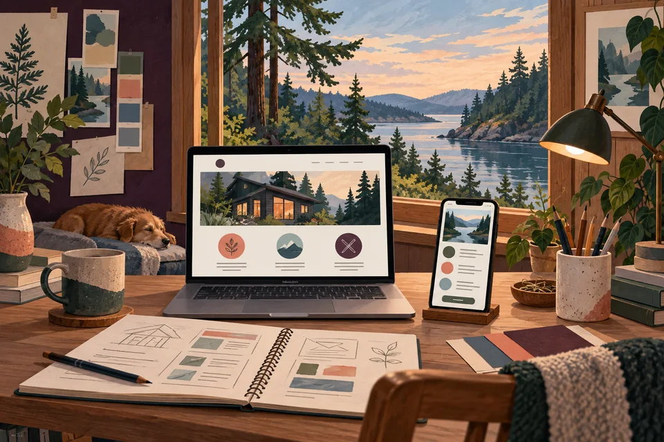
A Burley-inspired direction can suggest warmth or continuity without becoming a generic shoreline badge. Familiar waves and trees can make unrelated organizations look similar. Original relationships between simple forms may communicate the desired character while giving the company a more distinct identity.
Show us where your Burley logo loses clarity, and we can discuss the right level of identity work.
Test the direction in simple conditions before adding elaborate presentation. Reduce the size, remove the background, and inspect one-color reproduction. A sound mark should remain understandable without texture, lighting effects, or a scenic setting to make it appear convincing.

Specify the identity system needed at handoff
The deliverables should identify the approved mark, necessary arrangements, color versions, and formats. Vector artwork supports scalable reproduction, while common image exports support everyday digital tasks. A useful set of variants solves actual constraints rather than providing many versions that leave the owner uncertain which to choose.
Usage guidance can explain spacing, backgrounds, colors, and practical size limits. Discuss font and asset licensing where relevant. Source-file ownership and usage rights should be explicit so the business understands what it can give to future designers and production vendors.
Budget and timing depend on exploration, feedback, application needs, and the depth of guidance. A logo project does not automatically include a complete website or every promotional piece. Define the identity foundation and identify additional applications that require their own design scope.
Use the brief to resolve feedback
Discovery establishes the audience, business direction, and constraints. Concepts explore different ways to express them. During review, explain which qualities fit the company and which use remains unresolved. A popularity vote or a mixture of unrelated favorite elements may be less useful than evaluating each direction as a coherent idea.
Refinement addresses proportions, letterforms, spacing, and reproduction. Test the selected direction in the actual applications identified earlier. Consult relevant vendors when specialized printing, embroidery, or fabrication matters. A digital preview helps explain an application but cannot establish every physical production limit.
At handoff, organize approved files by purpose and separate them from drafts. Plan the rollout across visible materials and retire outdated working versions. Consistency becomes easier when staff and vendors can find the correct asset instead of reconstructing it from an old image.

Look at identities outside their presentation mockups
Galactic’s portfolio provides completed identity work for discussing readability and consistency. The examples shown here are not Burley client projects. Consider how the name and symbol relate, whether the design remains clear at small size, and how the different applications stay connected.
A coherent identity can support recognition, but credibility comes from the experience behind it. A new logo cannot guarantee demand or repair an unclear service offer by itself. Pair the visual system with accurate descriptions and reliable follow-up so the business promise remains consistent in both words and design.
Burley graphic design can extend the mark into useful introductions and service materials. Web development can apply it within an understandable online experience. Port Orchard and Gig Harbor service pages provide related guidance for a business working across a wider area.

Questions about logo design in Burley
Does a Burley logo need water or tree imagery?
No. Use local references when they suit the business. Typography or an original abstract form may create stronger distinction and work more easily in small applications.
Can we keep a recognizable element?
Yes, when it remains useful. Identify what customers recognize and test whether refinement can preserve it while resolving the current problem.
Should the location be part of the permanent mark?
Only if it supports the long-term identity. A separate location descriptor can retain local context while allowing accurate materials for a wider audience.
What files will future vendors need?
Discuss priority applications during scoping. Scalable artwork and appropriate color versions are common needs, while specialized production may require additional preparation.
How should we introduce the new identity?
Organize the approved assets, update the most visible materials first, and retire old working copies. A clear rollout list helps prevent conflicting versions from continuing indefinitely.
Related services and nearby areas
Burley web & design services · Burley web development · Burley graphic design · Port Orchard services · Gig Harbor services · Galactic portfolio
Plan your next step
Put clearer communication to work.
Give your business an identity that works wherever the introduction travels. Bring the name, current files, and the applications that matter most.
Discuss your Burley project