

Design for Milton’s varied customer encounters
Milton combines compact neighborhoods, regional roads, parks, the Interurban Trail, green corridors, and gathering places. A business graphic may appear on a vehicle, at a storefront, during an appointment, at a community event, or in regional sales. Each setting changes viewing distance, available attention, and the amount of detail that belongs.
A storefront sign or vehicle piece needs rapid recognition. A handout can explain process and coverage. A phone tile needs larger type and a visible destination. Dates, addresses, offers, restrictions, and access information must be verified by the owner and remain readable outside decorative artwork.
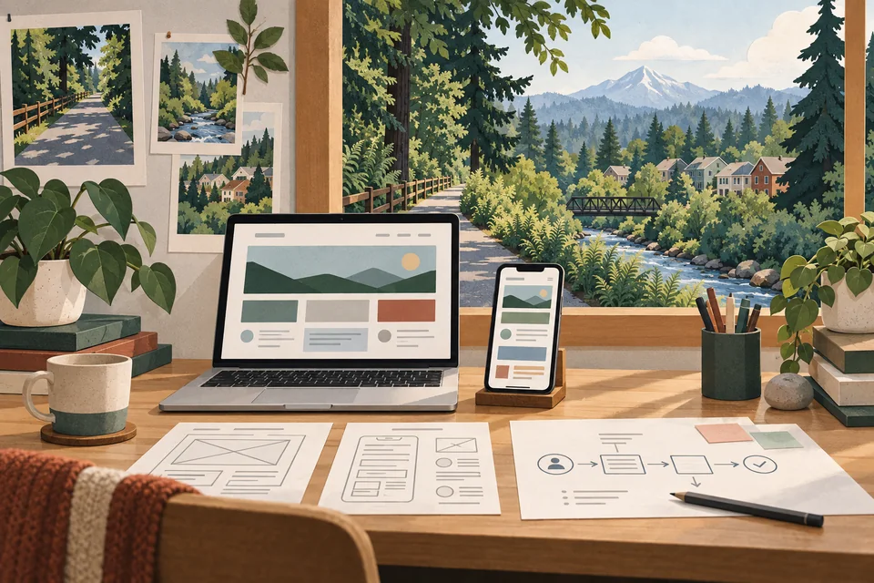
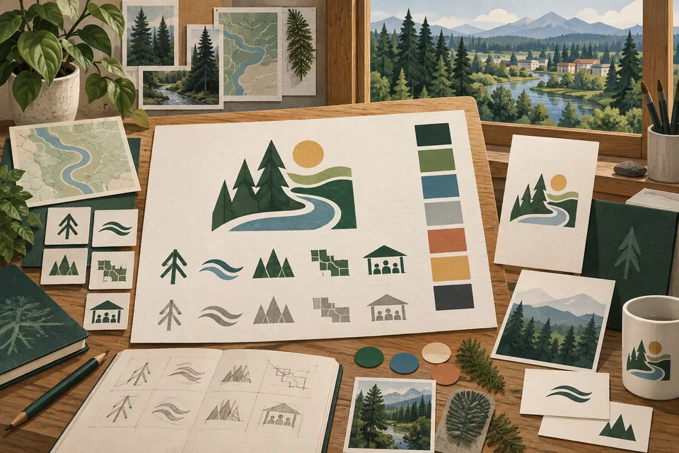
The design-table illustration uses generic trail, creek, evergreen, and warm paper textures. It does not reproduce a historic artifact, official trail sign, city event piece, real business identity, or completed local client project.
Give the reader one primary task
Decide whether the piece should announce, explain, compare, or direct. If a single flyer attempts all four, the main point may be lost. Name the customer action before choosing imagery or layout. Then decide which supporting facts are essential and which can live on a web page or in a conversation.
Confirm dates, locations, prices, conditions, and service boundaries before production. A wrong detail on a printed piece can be expensive to fix. For information that changes often, a controlled template or a link to an updated page may be more useful than a static print run.
A graphic should lead to a Milton website page that explains the same offer and gives a sensible next step. If the two conflict, customers may lose confidence and staff must clarify avoidable confusion. Consistent language is as important as consistent color.

Plan print and digital versions separately
A counter card, presentation sheet, poster, social post, and website banner are read at different sizes. The headline, amount of copy, crop, and contrast should follow the use setting. A large mockup can hide problems that become obvious on a phone or in a printed proof.
Print work may require bleed, safe margins, color specifications, and printer coordination. Digital work may need several aspect ratios and lightweight exports. The exact requirements should come from the chosen printer or platform before final approval. A useful proposal should name the intended files rather than say only “print and web.”
When a graphic appears on a web page or in email, keep essential text in accessible HTML nearby. Alt text can describe meaningful imagery, but it should not be the only place a date or service condition appears. This also makes updates easier when information changes.
Establish hierarchy before visual style
Galactic starts with audience, purpose, and the current identity. We decide what someone must see first, what supports the main message, and what action follows. Color, typography, photography, and illustration should make that sequence easier to follow rather than compete for attention.
If an existing logo works across planned applications, a graphic project can use it. If files are inconsistent or unreadable, Milton logo design may be a useful foundation. The scope should follow the problem; a single service sheet does not automatically require a broad rebrand.
For repeatable pieces, simple rules can help staff stay consistent: approved type, colors, mark placement, and message order. For a one-time campaign, the priority may be a finished production file. The handoff should match who will use and update the design after delivery.
Name each application and approval role
A file count is not a complete scope. One detailed infographic may require more work than several related cards. Determine whether message development, copy editing, image selection, illustration, alternate sizes, and production coordination are included. Compare proposals by what can be used at the end.
Prepare approved copy, current logo files, photos and rights, dimensions, printer or platform specifications, and the person who can confirm facts. If several stakeholders review work, choose one person to consolidate feedback. Late changes to an offer or date can require extensive revisions across formats.
Clarify editable files, exports, fonts, licenses, and future uses. A design presented in a mockup is not the same as a print-ready or reusable asset. The final agreement should say what is delivered and what restrictions apply to any third-party elements.
Review at real size before release
Discovery defines the audience, use setting, message, and next step. An initial direction tests hierarchy with real content. Useful feedback should describe what a reader misses or misunderstands. Once the communication works, refinement can improve tone, spacing, and visual consistency.
Before delivery, inspect every planned size. Can a phone user read the central point? Does a print proof have adequate margin and contrast? Does a link or QR destination explain the promised offer? The piece should be checked in its actual context, not judged only on a large monitor.
At handoff, confirm the approved exports, any editable files, and usage notes. If staff will update a template, identify which parts can change and which protect consistency. A useful system supports future communication rather than ending with one attractive image.

Design for trailside, storefront, event, and screen contexts
A Milton graphic may be seen at a compact storefront, inside a service conversation, near a community gathering, on a vehicle, in mail, or on a phone. Each setting changes viewing distance and available attention. Define the audience, placement, lifespan, and required response before deciding how much copy or visual detail belongs.
A sign or vehicle treatment needs rapid recognition. A handout can explain steps and coverage. A digital post needs a readable mobile hierarchy and an accessible destination for current details. Owners should verify dates, locations, prices, restrictions, organizers, and access statements. Event or park references must not imply sponsorship, city approval, or public access to private facilities.
For recurring pieces, establish a controlled hierarchy, color set, image treatment, spacing pattern, and call to action. Obtain printer or platform specifications before final design and inspect proofs at actual size. This approach helps staff update later materials without losing clarity and reveals production issues before they spread across a full campaign.
Evaluate portfolio examples by clarity
Galactic’s graphic portfolio shows completed work for businesses elsewhere. It is not evidence of Milton client work or a measured campaign result. Review how the examples handle hierarchy, scale, and the relationship between message and visual elements.
Assemble your current flyers, social posts, signs, or sheets. They reveal whether a customer sees conflicting service names, offers, or visual cues. A practical brief can then address the exact gap instead of copying a style that belongs to another brand.
Good graphic design can help people notice and understand information. It cannot guarantee response. Distribution, timing, offer quality, price, and follow-up all affect what happens next. Judge the finished piece first against its stated communication job.
Questions about graphic design in Milton
Can one graphic work in print and on social media?
The concept can carry across, but dimensions, reading distance, and copy often require separate layouts.
What should I bring to a design brief?
Bring the audience, purpose, approved copy, brand files, photos, dimensions, production requirements, and an approval contact.
Can an existing graphic be improved?
Yes, when rights and source files allow it. First identify whether the problem is the message, format, or hierarchy.
Will I get editable files?
That depends on the agreed scope. Confirm editable files, exports, licensing, and future use before work begins.
Is a new logo required?
Only if the current identity cannot support the planned materials. Many focused projects can use a workable existing mark.
Ready for a useful next step?
Give the next piece a clear job to do.
Share where it will appear, what it should explain, and the formats your team needs. We can discuss a useful Milton graphic design scope.
Discuss your Milton project