
Design for where the information will be used
Graphic design helps an Algona business explain its offer beyond the website. A printed handout, a presentation, and a digital promotion all carry information into different situations. Galactic Digital Studios helps organize that information so the reader can identify the message and the action without sorting through competing details.
The Auburn Area CONNECT Chamber serves Algona alongside Auburn and Pacific. Businesses participating in that regional environment may need materials that work for people unfamiliar with their premises or service area. The design should make the business name, offer, and relevant coverage clear.
Consider a hypothetical Algona service company introducing itself at a regional business meeting. A concise capability sheet can prepare a follow-up conversation better than a crowded flyer listing everything the company has ever done. This is a planning example, not a claim about a local client. Your distribution setting determines which information belongs on the page.
Give each piece one primary job
Start with what the reader should understand or do. A leave-behind may summarize services and point to more detail. A banner must communicate quickly at a distance. A digital graphic may introduce one offer while the linked page explains its terms. Trying to make every format carry the entire business story usually weakens the hierarchy.
Write the core message before choosing the layout. Separate essential facts from supporting detail and identify any information that changes often. If a service has restrictions, provide enough context to avoid a misleading impression. Attractive design should help accurate information travel, not conceal qualifications in unreadable text.
Connect the piece to your Algona business website when the reader needs more explanation. Ensure the destination answers the question raised by the graphic. A strong handout loses usefulness if its link leads to an unrelated homepage section or an offer that no longer exists.
Agree on formats before artwork is finalized
Print and digital outputs have different requirements. A social image, a document for on-screen reading, and a large printed sign need different proportions and review conditions. Identify the intended formats, sizes, and vendors early so the layout can account for them instead of being forced into each shape at the end.
For print work, request specifications from the chosen producer. Trim, bleed, material, and finishing choices can affect artwork preparation. For digital use, establish where the asset appears and what remains readable after scaling. A proof or sample can reveal issues a full-size monitor view hides. Production and installation arrangements should be stated separately where relevant.
Budget depends on the number of concepts, formats, content variations, and revision needs. A campaign with several sizes takes more adaptation than a single finished layout. If the logo is outdated or available only as a poor-quality image, discuss identity preparation before it becomes a bottleneck for the whole project.
Use feedback to protect the message
Discovery establishes the reader, distribution method, and intended action. Supply approved wording, available brand assets, and vendor requirements. Identify who checks factual accuracy and who approves design. If several people contribute, agree on a single set of consolidated comments so the piece does not accumulate contradictory instructions.
The initial direction should make the hierarchy visible: what the reader sees first, what explains it, and what follows. Review whether the layout suits the setting. A document used in a detailed sales discussion can carry more information than a graphic glimpsed on a phone. That difference should guide revisions.
Before delivery, check names, service descriptions, destinations, and production specifications. Confirm the output files and any editable templates included in the scope. Keep the approved version in an accessible location. Clear file naming helps your team and vendors avoid printing an obsolete draft after the project has been completed.

Use examples to judge clarity and application
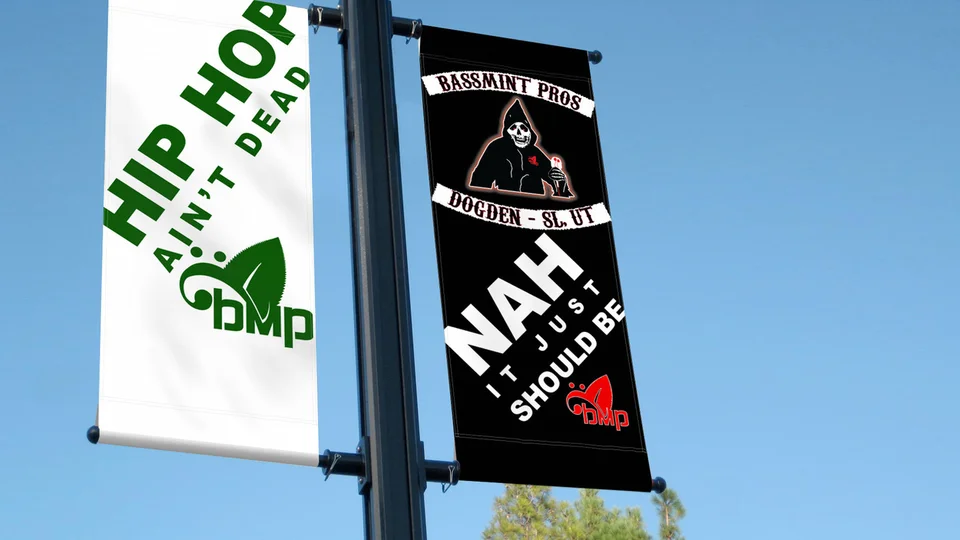
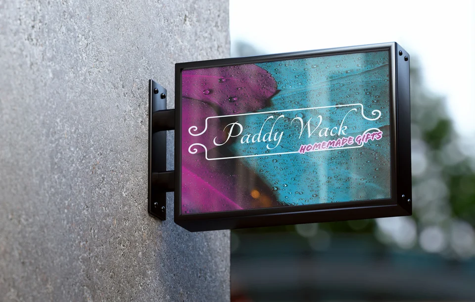
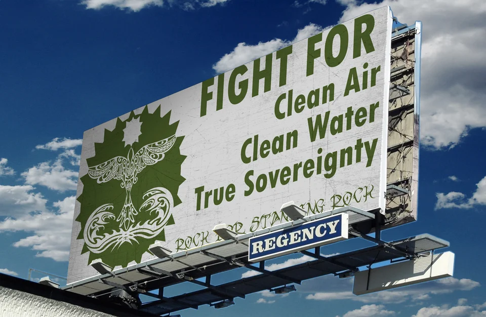
The supporting images show Galactic portfolio work across graphic presentations and visual identities. They are not represented as Algona commissions, and a mockup is not evidence that a sign or banner was installed. Use the examples to assess layout, contrast, balance, and the relationship between a brand and its message.
The Galactic portfolio gives a broader view of the work. When discussing a sample, explain what is useful about it for your situation: a clear headline, a limited color palette, or a strong distinction between primary and secondary information. Those observations lead to a better brief than asking to reproduce another company's design.
Remote collaboration allows your Algona team to provide business knowledge and review material where it will actually be used. Graphic design can improve recognition and make information easier to understand. Response still depends on the offer, distribution, audience, timing, and follow-through, so the project should avoid promises that artwork alone will produce a fixed result.
Build consistency without freezing every message
A useful visual system leaves room for changing information. Keep stable elements such as logo placement, typography, and recurring colors consistent while allowing the message to suit the audience. If your team needs recurring graphics, discuss which template formats they can realistically edit and what instructions would help.
A business working across Auburn, Pacific, and Algona may use the same visual identity throughout its service area. Regional versions should change only where the offer or logistics actually differ. Separate documents are not automatically necessary just because the recipient is in a different city.
Plan how old materials will be replaced. Update the linked website or download alongside the printed piece so the two tell the same story. Record where approved artwork lives and which information needs regular review. This small amount of organization can save repeated correction work when the next campaign or event arrives.
Questions about graphic design in Algona
Can we start with a single sales sheet?
Yes. A focused piece is a reasonable starting point when the audience and purpose are clear. Share the content, distribution plan, and required output so the scope includes the work needed to make it usable.
Is printing included in graphic design?
Do not assume it is. The proposal should distinguish design and file preparation from printing, shipping, and installation. Vendor coordination and proof review should also be clarified where they are needed.
Can you use our current logo?
Provide the best available source files and any usage guidance. The project can assess whether those assets suit the intended formats or whether preparation is needed before layout work begins.
Will we receive editable templates?
That depends on the agreed deliverables. Identify who will make future edits and which software they use. Editable files may also depend on font, stock image, or other third-party licensing arrangements.
What helps us avoid repeated revisions?
Approve the main message, specifications, and factual content early. Consolidate feedback and explain the communication problem behind a requested change. Late changes to dimensions or core copy can affect the whole layout.
A practical next step
Give your message a format that works.
Bring the information you need to communicate, where the piece will appear, and the action you want the reader to take. We can discuss a focused graphic design project within the broader Algona web and design offering.
Plan your Algona project