
Let the business lead the identity
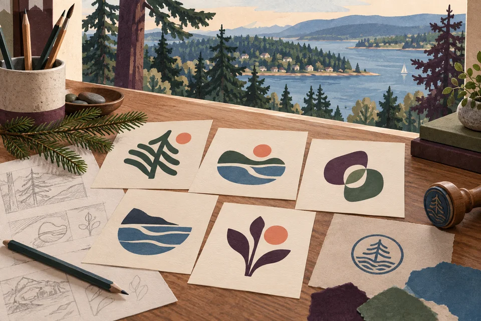
A logo for an Artondale business should identify that business before it represents the surrounding landscape. The community’s Gig Harbor Peninsula setting offers visual references, but a tree, inlet, or boat alone may say little about your offer. Start with the name, audience, and qualities you want customers to remember.
Pierce County’s community plan describes Artondale north and west of the head of Wollochet Bay. That context can inspire a visual direction without defining every design decision. A professional practice may need precise typography; a hands-on service may need a bolder mark that remains clear on equipment. These are possible briefs, not claims about local customer demand.
Galactic approaches logo design as a usable identity system. The aim is a distinctive foundation that works across real applications and stays recognizable as materials change. Regional cues are optional tools, not a requirement for proving that a business serves Artondale.
Decide whether the problem is the mark or its use
A business does not automatically need a new logo because its materials look inconsistent. Sometimes the original mark is sound but the team lacks proper files, spacing rules, or a limited color palette. A focused cleanup may address the problem without discarding recognition that existing customers already have.
A larger redesign can make sense when the name has changed, the offer has shifted, or the current identity repeatedly fails in essential uses. List the specific failures. Perhaps the lettering disappears in a small website header or a detailed symbol cannot be reproduced on workwear. Those observations give the project measurable constraints.
For a hypothetical service expanding beyond Artondale, a location-heavy tagline might be more limiting than the core mark. Separating the tagline from the logo can preserve a local connection while allowing accurate regional materials. The decision should follow the business plan rather than an assumption that growth requires a completely different identity.

Bring the name and application list into the brief
Confirm the intended business name, spelling, and any descriptor before detailed design begins. A name still under discussion can change the entire composition. Include existing brand files and explain which elements customers already recognize. References are useful when you describe the qualities you like rather than ask for another company’s mark.
List the places the logo must work first. A website header, social avatar, proposal cover, vehicle graphic, and embroidered garment place different demands on shape and detail. Prioritizing the actual uses helps avoid spending the review process on attractive mockups that have little connection to daily operations.
Identity research can inform creative decisions, but it is not legal trademark clearance. If the name or mark requires legal review, arrange that through appropriate counsel. Avoid borrowing public seals, school identities, neighborhood marks, or certification imagery to imply an association the business does not have.
Explore a direction, then test its simplest form
Galactic begins with the audience and the role the business needs to express. A direction might be calm and precise, warm and approachable, or sturdy and practical. Those qualities should become choices in letterforms, spacing, proportion, and symbol construction rather than a list of adjectives attached to an arbitrary drawing.
We evaluate the mark without relying on a scenic background or elaborate presentation. A design should remain understandable in one color and at the small sizes that matter. Detailed illustration can belong elsewhere in the brand; the core identity needs enough simplicity to survive ordinary reproduction.
A peninsula-inspired shape can be considered when it adds meaning, but it should have a distinctive relationship to the business. Generic evergreen emblems can look similar across unrelated organizations. Typography, a considered abstract form, or a strong wordmark may create a more useful identity than combining several familiar local symbols.
Ask for a working file system, not one picture
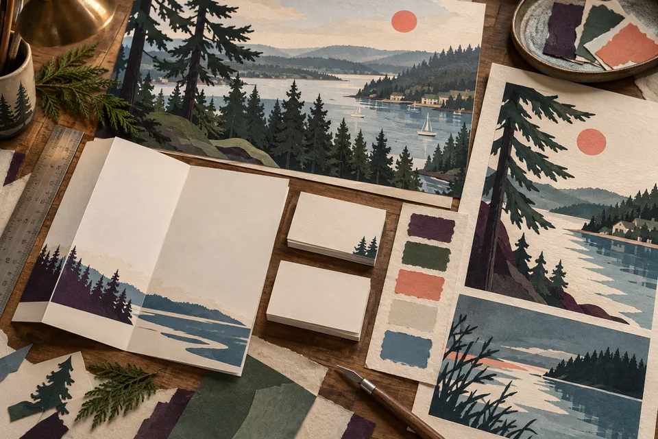
The deliverable list should identify the approved mark, necessary arrangements, color versions, and practical formats. Vector files support scalable reproduction; raster exports serve common screen uses. A compact symbol or alternate arrangement may be needed where the full name will not fit. Agree on those requirements during scoping.
Basic usage guidance should explain colors, spacing, minimum practical size, and background choices. If typefaces or other elements require licenses, clarify the owner’s responsibilities. Source files and usage rights should be addressed in the agreement rather than inferred from the fact that a preview was approved.
Cost and timing depend on the brief, exploration, application needs, feedback process, and handoff requirements. A logo project does not automatically include a complete website, packaging system, or ongoing graphic production. Define what the identity needs to support now and which extensions can be planned separately.
Give feedback against the brief
Discovery establishes the business story and practical constraints. Initial directions test different ways to express those priorities. When reviewing them, explain what feels inconsistent with the intended audience or which use case appears unresolved. That helps refine the work more effectively than combining favorite details from unrelated options.
Once a direction is selected, review proportion, spacing, and reproduction. Test the mark in the actual website header, a small document heading, and a one-color application. Ask the relevant production vendor about technical limits when a specialized use matters. A screen mockup alone cannot establish the quality of a physical output.
At handoff, organize the approved files by purpose and retire outdated versions from shared folders. Introduce the identity across the most visible touchpoints first. A simple rollout list keeps a new website, printed materials, and proposal documents from presenting several conflicting versions indefinitely.

Use examples to discuss recognition and restraint
Galactic’s portfolio offers existing identity work to examine with practical questions. Does the lettering remain readable? Can the symbol stand alone where necessary? Do the applications feel like the same business? The examples shown are not Artondale client projects and do not establish commercial results for a new identity.
A coherent mark can support recognition, but trust develops through the service and the customer experience around it. A redesign cannot guarantee leads or repair an unclear offer by itself. Pair identity decisions with accurate descriptions and a dependable response process so the visual promise matches the business.
Our Artondale graphic design service can extend the identity into useful materials, while web development can carry it into the customer journey online. See the Gig Harbor and Tacoma pages when a broader regional project is relevant to the business’s actual reach.

Questions about logo design in Artondale
Must the logo include Artondale?
No. Include a location only when it serves the identity and future plans. A separate descriptor can communicate local context without becoming inseparable from the mark.
Can we keep a recognizable element?
Often that is worth exploring. Identify what customers recognize and test whether it can be refined while resolving the current practical problems.
Will we receive a one-color version?
Discuss the required variants in the scope. One-color reproduction is an important test for many identities and should be considered before final approval.
Is a logo the same as a full brand?
No. The logo is one part of a larger system that may include language, typography, imagery, and applications. Define how much of that system the project includes.
How do we choose between concepts?
Compare each direction with the agreed audience, character, and use cases. Gather focused feedback from the decision-makers rather than treating the choice as an open popularity vote.
Related services and nearby areas
Artondale web & design services · Artondale web development · Artondale graphic design · Gig Harbor services · Tacoma services · Galactic portfolio
Plan your next step
Put clearer communication to work.
Make your identity easier to recognize and easier to use. Share the current logo, the business direction, and the applications that matter most.
Discuss your Artondale project