

Make recognition dependable across everyday materials
Logo design for an Esperance business should help people connect each interaction with the same company. Galactic Digital Studios develops identity directions around the business's audience, character, and applications. The mark needs to work in routine settings, from a small website header to a reference sheet a customer keeps.
Esperance has its own Census-designated community identity within Snohomish County, alongside familiar nearby place names such as Edmonds. A business can express that local connection without making geography the entire concept. The logo should remain understandable to a customer who knows the company but has never heard the community name.
Start with the impression the business needs to communicate. A calm personal service, a precise technical practice, and an expressive creative business may require very different directions. Local context can inform the conversation, but the audience and offer should guide the final choices rather than a generic regional symbol.
Decide which familiar elements are worth preserving
A logo that looks dated may still contain useful recognition. The name arrangement, a color, or a simple symbol may be familiar to returning customers. Identify those assets before deciding how much to change. A refinement can improve usability while retaining continuity, whereas a new direction may be needed when the business itself has changed.
Collect examples of the identity in real use. Look at small digital placements, printed documents, and any supplier-produced materials. Missing file formats, awkward spacing, or inconsistent versions may be the practical problem. Those issues need to be distinguished from a broader question about what the brand should communicate.
For a new business, clarify the name and intended audience before investing in final artwork. For an established business, describe what is different now and what should remain recognizable. A specific brief gives the project a useful basis for choosing between repair, refinement, and a more substantial redesign.

Design for compact spaces and simple reproduction
A logo should remain legible at the sizes that matter to the business. Test the name in a mobile header and on an ordinary document, not only on a large presentation board. Fine details and delicate spacing can disappear when the artwork is reduced or reproduced by a different process.
A useful identity may include more than one arrangement. A horizontal version can fit a website, while a compact version may suit a small label or profile image. Each should feel related. The variations should solve real application needs rather than create a confusing set of alternatives for staff to choose among.
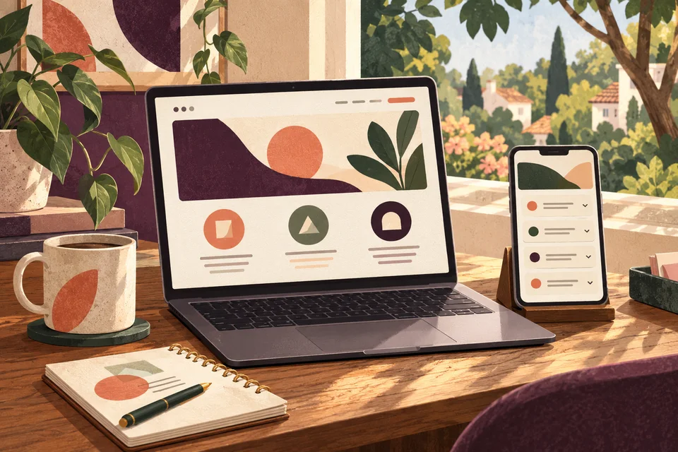
Color should reinforce recognition without being its only source. Discuss a one-color treatment and use on light or dark backgrounds. A hypothetical Esperance business producing simple office documents may need those versions more often than an elaborate display mockup. That is an application example, not a claim about a local commission.
Use the brief to make creative decisions explainable
We connect the offer, audience, desired impression, and essential uses before exploring a direction. References can help describe qualities such as friendliness or precision, but the goal is an identity appropriate to your business. Copying a nearby company's visual cues would not establish a useful distinction.
Review concepts through practical questions. Does the name read easily? Does the impression fit the service? Can the mark be recognized without a decorative background? These questions help separate a business concern from a personal preference and give refinement a clearer purpose.
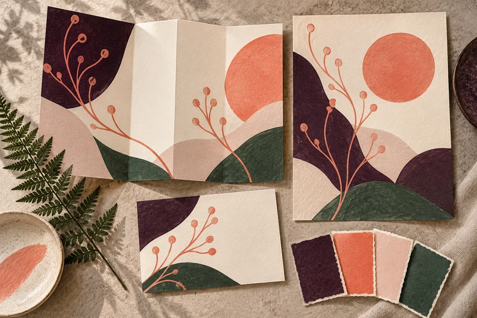
A regional reference can be subtle or absent. The open-loop studies on this page are conceptual explorations of a compact identity, not a finished Esperance client logo. Your project should emerge from its own brief. It should not imply a connection with the park, a public agency, or another local organization unless that relationship is real and authorized.
Let’s plan logo design around your Esperance customers’ next decision.
Refine the mark and its uses together
A project can move from discovery through initial directions, focused feedback, refinement, and delivery. Establish the final decision-maker and the role of other reviewers early. One consolidated response helps keep the work tied to shared priorities instead of turning each round into a collection of unrelated requests.
Once a direction is chosen, refine proportions, spacing, and the relationship between symbol and name. Review the required arrangements at realistic sizes. Compare plain artwork with selected application examples so an attractive scene does not hide a weakness in the actual mark.
Before delivery, verify the approved spelling, colors, and versions. Discuss how the files will be labeled and which ones suppliers should receive. Simple usage guidance can prevent stretching, improvised color changes, and repeated use of a low-resolution preview. The handoff should support the way the team will actually apply the identity.

Plan continuity through files and rollout decisions
The scope depends on creative exploration, identity complexity, required variations, and supporting guidance. A focused logo update differs from a full brand system with templates, signage, and a website. List the immediate uses and later priorities so the proposal includes the work that matters to the business.
Confirm scalable vector artwork, suitable screen images, source-file arrangements, and usage terms. Fonts or licensed components may have separate requirements. Creative development does not establish legal name or trademark clearance. If naming is unresolved, address that dependency before finalizing artwork and ordering materials.
A rollout can happen in stages when it is planned. Update digital assets and frequently used documents, then coordinate physical items according to their production needs. Explain the transition to staff and keep approved assets easy to find. Deliberate continuity helps customers recognize the business while the new identity becomes familiar.

Look for a mark that holds together without special treatment
Galactic's portfolio provides existing work for discussing identity design and application. Examine legibility, proportion, and consistency across materials. Ask how the decisions could translate to your own uses. The portfolio examples shown here are broader studio work, not represented as Esperance client projects.
For your direction, evaluate the reasoning and the practical tests alongside the polished presentation. A logo can help build recognition and support credibility, but trust also comes from service and communication. Consistent application over time matters more than an unsupported promise that a visual change will produce a particular business result.
Questions about logo design in Esperance
Can we keep the current name and colors?
Yes, if they remain appropriate and usable. A focused project can preserve familiar elements while improving the artwork or its applications. Identify what customers recognize and what fails in practice before deciding on the extent of change.
Does the logo need a local landscape?
No. A landscape reference should have a clear connection to the business. Typography or a simple abstract concept may be more distinctive and easier to reproduce. Local relevance can inform the brief without dictating the symbol.
What should we test before approval?
Review the smallest important use, plain backgrounds, one-color reproduction, and the required arrangements. Use realistic applications from your business. A large mockup alone cannot show whether the identity will work in everyday materials.
Will logo design include document layouts?
Only if those applications are in the scope. A logo system provides assets, while a reference sheet or presentation also needs content and layout decisions. Plan related graphic and web work around the approved identity.
How can we make the new files easy to use?
Agree on file names, formats, and proportionate usage guidance. Store the approved set where staff can find it and remove superseded versions from routine use. Confirm supplier requirements before sending assets for production.
Connect the next part of your project
Esperance web & design services · Esperance web development · Esperance graphic design · Explore the Galactic portfolio · Browse all service areas · Design services in Edmonds · Design services in Brier
Plan your next step
Give your business a useful next step
Bring your current identity and the places customers see it most often. We can plan Esperance logo design around familiar strengths, clearer character, and practical use.
Discuss your Esperance project