
Build recognition around your own business story
Galactic Digital Studios provides logo design for businesses serving American Fork, Utah. A useful logo gives your name a consistent visual expression, whether it appears on a website, a proposal, a small profile image, or a printed piece. We connect the identity direction to your audience and offer, then consider how it will work in the applications that matter to you.
The city’s official history summary explains that American Fork takes its name from the river. Local geography can be a starting point for a creative discussion, but it is not a requirement for the mark. Your identity should help someone recognize your particular business rather than blend into a collection of similar regional symbols.
Decide whether the problem calls for a refresh
An existing logo may already carry useful recognition. Before discarding it, identify what is failing: small lettering, uneven spacing, an outdated business name, or a shape that becomes unclear in ordinary use. A targeted refinement may preserve what customers know while improving practical performance.
A more substantial redesign may be appropriate when the business has changed its audience, services, or position. Explain those changes in the brief so the design is responding to a real need. Changing style without understanding the business can create replacement work without improving the introduction.
Collect the files you currently use and show them in context. A screenshot of a social profile, a recent proposal, and a printed label can reveal different issues. This review makes it easier to separate problems in the core mark from problems caused by inconsistent application or poor-quality exports.

Design for ordinary use, including the smallest version
Choose the primary applications before exploring directions. A long business name on a website header has different constraints from an avatar or an embroidered item. We consider proportions, letter spacing, contrast, and the ability to recognize the form when fine detail disappears.
A useful identity may include a main arrangement, an alternate arrangement, and a simplified mark where the business supports one. Each variation should have a reason to exist. Too many options can leave a small team uncertain about which file to choose and make the identity feel less consistent.
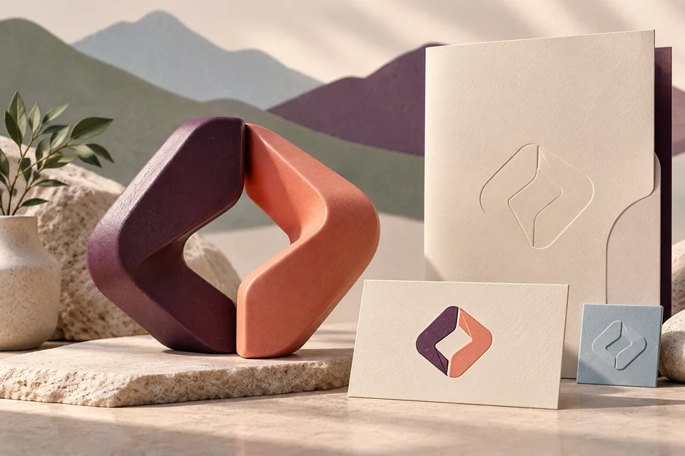
Test a proposed direction in one color as well as its intended palette. Review it on light and dark backgrounds and at realistic sizes. A polished dimensional mockup can help illustrate an application, but the flat artwork must work independently. The logo should not rely on lighting effects or a textured surface to become legible.
Evaluate directions against a shared brief
Our approach begins with what the business does, whom it serves, and how it wants to be understood. Useful inputs include your existing materials, a description of the offer, and the places where the logo will appear. Reference images can help discuss tone, but the goal is an identity appropriate to your business, not a copy of another organization’s work.
Feedback becomes more productive when it connects to that brief. Explain whether a direction feels too formal for the audience, loses the name at a small size, or resembles a visual convention you want to avoid. That gives refinement a concrete purpose beyond choosing a favorite color.
American Fork’s historic downtown resources offer context for local character, not a ready-made brand system. If history informs the direction, use it thoughtfully. Avoid civic seals or imagery that could suggest an official relationship your business does not have.
Let’s plan an American Fork identity that works wherever your name appears.
Agree on files, usage, and rollout needs
A logo proposal should describe the exploration and refinement process, the intended applications, and the final deliverables. Ask which vector and raster formats will be supplied, which variations are included, and whether a basic usage guide is part of the scope. A single small image is rarely enough for every business use.
Discuss ownership arrangements, any third-party typefaces, and the licenses relevant to editable files. Naming, additional brand strategy, extensive guidelines, and production artwork for particular vendors may require separate work. Make those needs visible before deciding the project is limited to a mark.
Budget and schedule depend on the depth of exploration, decision-making process, and number of applications prepared. If a launch date depends on signage or packaging, include those production dependencies. The design handoff and a completed physical rollout are different milestones, and both need a responsible owner.
Move from exploration to a usable identity set
Discovery captures the business goals, audience, and visual constraints. Resolve the approved business name and any required wording early. Changing the name after a direction is developed can affect proportions, layout, and the meaning of the concept itself.
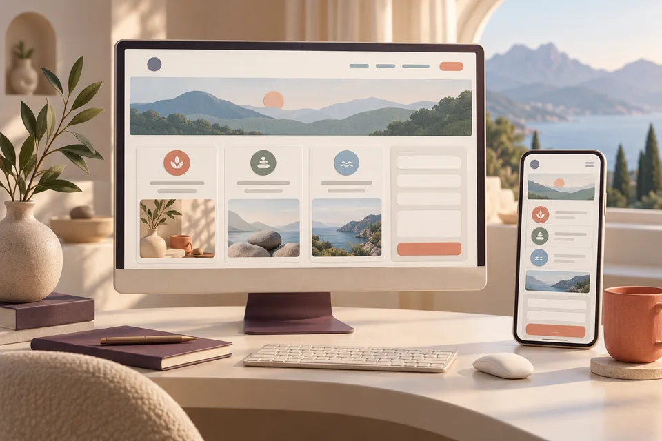
During exploration, judge directions in a few relevant applications rather than an overwhelming collection of decorative mockups. Choose the direction that best supports the brief, then refine details and practical variations. One consolidated feedback process helps avoid contradictory instructions from different stakeholders.
Before delivery, review the agreed file set and intended uses. Keep a clearly labeled folder of current approved artwork, and archive older versions so they are not accidentally sent to vendors. Explain which versions belong on dark backgrounds, which are appropriate for small uses, and when additional production preparation may be needed.

Plan recognition beyond the launch day
A logo gains usefulness through consistent application. List the places where the old identity appears, then prioritize customer-facing updates such as the website, proposals, social profiles, and printed materials. Some replacements may happen at once; others may follow a practical inventory cycle. Decide how to handle that transition before new files start circulating.
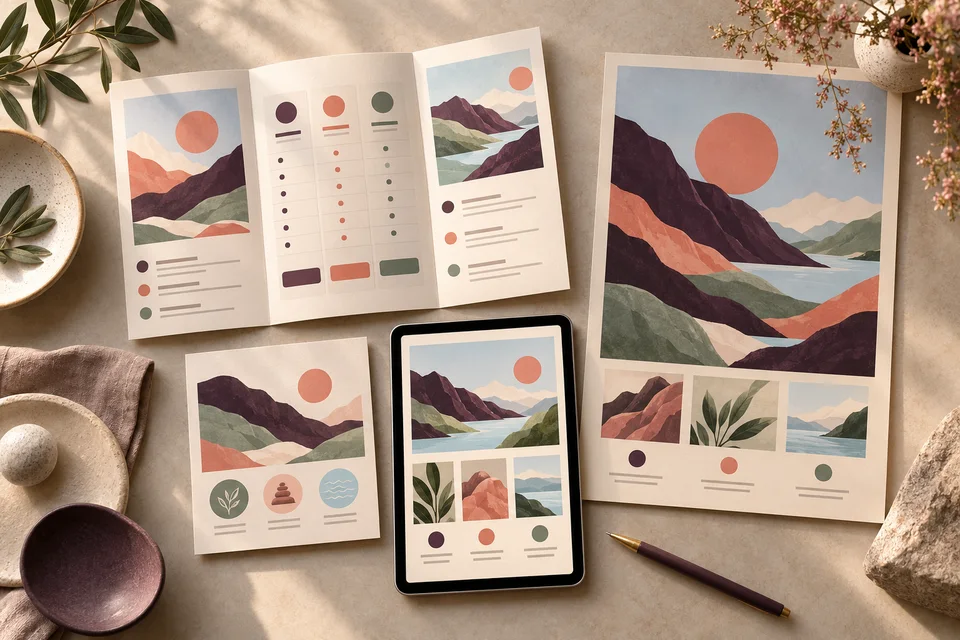
Our identity portfolio offers examples to discuss for their relationship between form, name, and application. The selected work shown here is not presented as American Fork client work. A mockup demonstrates a possible presentation, not proof of sales impact or an installed object.
Coordinate the rollout with web development and graphic design where those materials need updates. The American Fork overview explains the broader service mix. Consistency helps the identity feel established, while your service and customer experience supply the substance behind it.

American Fork logo design questions
Does every business need a mountain symbol?
No. A regional reference can be appropriate when it supports your business story, but it should not be the automatic answer. Typography, abstract forms, and other relevant ideas may create a more distinctive and useful identity.
Can we retain our current colors?
Yes, existing colors can be part of the brief. Review how they perform in the required applications and whether customers already associate them with the business. Any adjustment should have a clear purpose and a manageable rollout.
Will the logo work for signs and small profile images?
Discuss both uses at the start and review the proposed identity at realistic scales. Different arrangements or simplified versions may be appropriate. Sign production and platform-specific exports should be identified in the agreed deliverables.
Does logo design include trademark clearance?
Logo design should not be treated as legal clearance. Clarify any separate review you need before adopting a name or mark, and obtain qualified advice where appropriate. A visual design process alone does not establish exclusive rights.
How can we avoid inconsistent versions after delivery?
Store approved artwork in one shared location, give files clear names, and document the basic usage choices. Assign someone to manage vendor requests and future changes so old exports do not quietly become the default again.
A practical next step
Create an American Fork business identity your team can apply with clarity and confidence.
Bring your current materials, the questions you want to resolve, and the priorities for your next project. We can use that context to define a focused scope and a sensible sequence for the work.
Discuss your American Fork project