
Make the business recognizable wherever its name appears
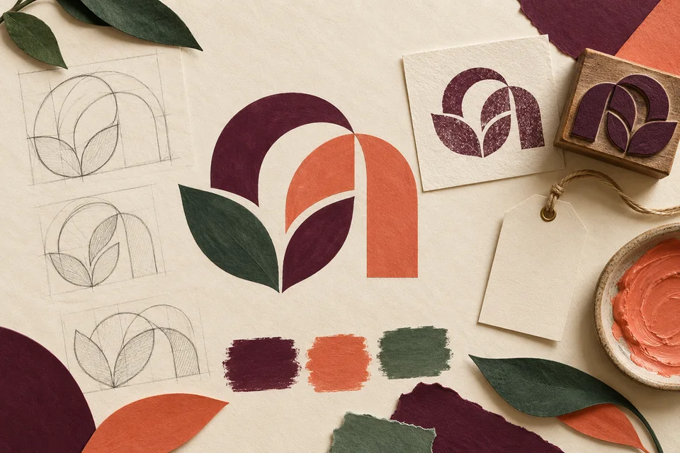
Logo design for a Maltby business starts with recognition: can a customer connect a website, proposal, and everyday business material to the same company? Galactic Digital Studios develops identity directions around the business's audience and practical uses. The mark should support a clear introduction while remaining usable beyond a large presentation image.
Maltby is a Census-designated community in Snohomish County, with county planning materials describing both rural surroundings and a separate urban growth area. That setting can inform a conversation about character, but it does not prescribe a single local aesthetic. A precise technical service and a warm personal service may need different visual voices.
Local imagery is one possible direction, not a requirement. An evergreen reference should have a reason to appear in the identity beyond the business's location. Typography or an abstract form may express the offer more clearly. The brief should describe the company you are building, including customers beyond the immediate community.
Decide whether the problem is recognition or application
An existing logo may be recognizable but difficult to use. Perhaps the business has only a small image file, or a long arrangement does not fit a website header. These issues may call for reconstruction or practical variations rather than a complete change in identity. Identify the failure before deciding on the remedy.
A broader redesign may make sense when the business has changed its offer, audience, or name. In that case, review what recognition is worth preserving and what creates the wrong impression. Existing colors or a familiar letterform may provide continuity even when the overall system needs significant refinement.
Gather examples of where the current identity appears. A proposal, work shirt, invoice, and social profile can reveal inconsistent use or missing versions. Bring both successful and awkward applications into the discussion. The goal is to define a project around real needs rather than a general feeling that the logo looks dated.

Test the mark at the sizes that matter
A logo should be evaluated as plain artwork and in realistic applications. Large mockups can hide weak spacing, fine details, or a name that becomes unreadable when reduced. Test the smallest important use early, whether that is a mobile header, document footer, or modest label.
Color should help the identity without carrying all of its recognition. Discuss a one-color version and how the mark works on light and dark backgrounds. A design that depends on a subtle gradient may need an alternate treatment for a supplier or a simple office printout. Those variations should feel like the same identity.
For a hypothetical Maltby business using both digital documents and physical equipment labels, durability and clarity may matter more than intricate scenic detail. This is an application example, not a client claim. The necessary tests depend on your actual uses and the production methods involved.
Use a business brief to guide creative feedback
The brief should explain the audience, offer, desired impression, and essential applications. Words such as dependable or approachable become more useful when connected to concrete situations. Describe what customers should understand about the business when they encounter its name for the first time.
Creative directions can then be reviewed against that shared purpose. Ask whether the name is legible, whether the impression fits the work, and whether the result is sufficiently distinct from the references you brought. Inspiration can establish qualities to explore without turning another company's identity into a template.
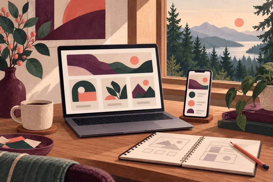
Maltby context can enter through a restrained palette or sense of material and proportion without copying a civic symbol or nearby organization's mark. The generated studies on this page illustrate possibilities only. A final direction should arise from your business brief and should not suggest affiliations the company does not have.

Let’s plan logo design around your Maltby customers’ next decision.
Refine the system, not just one presentation image
A logo project can progress through discovery, initial directions, focused feedback, refinement, and delivery. Establish the decision-maker and review expectations at the beginning. Consolidating feedback gives the designer a coherent problem to solve instead of several unrelated requests for different shapes and colors.
Once a direction is selected, refine proportions, spacing, and the relationship between name and symbol. Compare any horizontal, stacked, or compact versions that the scope requires. These arrangements should work as a family, with a clear reason for choosing one over another in everyday use.
Review the approved spelling and final applications before delivery. Ask how the files will be named and which version a staff member or supplier should use. A concise usage guide can help prevent stretching, inconsistent colors, or low-resolution substitutions. Its contents should reflect the actual identity system and the agreed handoff.

Plan the rollout before ordering new materials
The scope depends on exploration, the complexity of the business name, necessary variations, and supporting guidance. A focused logo engagement is different from a full brand system with document layouts, signage, and a website. Identify immediate applications and later priorities so the proposal covers the work you intend to use.
Confirm the vector and raster formats, source-file arrangements, and usage terms in the agreement. Fonts and other licensed elements may carry separate conditions. If the business name is still unsettled, resolve that dependency before final artwork. Creative development does not itself establish legal clearance for a name or trademark.
A rollout also takes coordination. List the places customers encounter the old identity and decide when each will change. Digital assets may be quicker to update than printed stock or supplier-produced items. A planned transition can preserve recognition while avoiding a period in which several unrelated versions appear to represent different businesses.

Look for consistent decisions across applications
Use Galactic's portfolio to discuss identity choices and how they translate into working materials. A useful review examines legibility, proportion, and consistency rather than relying entirely on a polished scene around the mark. The existing examples shown here are broader studio work, not represented as Maltby commissions.
For your project, request a clear explanation of why a direction fits the brief. A logo can support recognition and credibility, but trust also depends on the service behind it. The strongest identity becomes familiar through consistent use and reliable customer experiences, not through an unsupported promise that new artwork will increase sales.
Questions about logo design in Maltby
Does a Maltby logo need trees or mountains?
No. Local references are optional and should support the business rather than substitute for a clear idea. Typography, abstract forms, or a restrained visual detail may offer a more useful identity for your audience and applications.
Can we improve the current logo without replacing it?
Yes. A focused refinement may resolve spacing, legibility, or file-quality problems while retaining recognizable elements. Review the existing artwork and applications first so the scope distinguishes practical repair from broader identity development.
What versions should be delivered?
Discuss the arrangements, color variants, vector artwork, and screen-ready images needed for your uses. Confirm source files and usage terms explicitly. Delivery should make it easy for staff and suppliers to select the correct version.
Will the logo project include a website redesign?
Only if that work is included in the agreed scope. A new logo can provide a foundation for web and graphic design, but those applications require their own content and layout decisions. Plan the related work before scheduling the rollout.
How can several owners review the design effectively?
Agree on the brief and decision process before reviewing directions. Gather concerns into one response and explain which business need each concern affects. Testing real applications helps resolve differences more productively than comparing personal preferences alone.
Connect the next part of your project
Maltby web & design services · Maltby web development · Maltby graphic design · Explore the Galactic portfolio · Browse all service areas · Design services in Clearview · Design services in Cathcart
Plan your next step
Give your business a useful next step
Bring your current identity, business goals, and the places the mark needs to work. Let’s plan a Maltby logo system that your team can apply with confidence.
Discuss your Maltby project