

Help the message survive beyond the first conversation
Graphic design gives a West Valley City business a way to explain its offer when a team member is not there to talk through it. Galactic Digital Studios helps organize printed and digital materials around the reader's next decision. The goal is useful communication that stays recognizable wherever the piece is shared.
ChamberWest connects West Valley City with other west-side business communities. For a company building relationships across that area, a document may reach people unfamiliar with its location or capabilities. The piece should explain enough to stand on its own rather than rely on the context of the original introduction.
A hypothetical West Valley City supplier might hand a service overview to one contact who forwards it to a purchasing colleague. That second reader needs a clear explanation of fit and next steps. This is a planning scenario, not a client claim. It helps establish what belongs in the design before choosing a visual style.
Put the decision-making information in order
Choose the primary job of the piece. A capability sheet may help someone assess whether to start a conversation. A promotional graphic may introduce a single offer. A banner may need to identify the business at a glance. Each can use the same identity while giving different information priority.
Begin with approved wording and distinguish essential facts from supporting detail. If specifications or limitations affect the offer, make them readable and easy to locate. Avoid filling every open area simply because more information exists. A crowded document can hide the very fact that would help a customer decide.
Connect the piece to an appropriate website page when more detail is needed. The destination should continue the same conversation. If a sales document introduces a particular service, sending the reader to an unrelated page adds work. Aligning the two makes the whole communication more useful without requiring either format to contain everything.
Prepare for the actual reading and production conditions
A document viewed on a laptop, a printed sheet, and a large display have different requirements. Review each at a realistic size and distance. Text that seems readable in a design application may be too small in the final setting. A layout that works horizontally may need substantial adaptation for a narrow digital placement.
Gather output specifications before final artwork is prepared. Print vendors may have requirements for size, bleed, color, and file setup. Digital placements may crop images or impose different proportions. Confirm whether the scope includes adapting the design, preparing final files, reviewing proofs, or coordinating with a producer.
For a West Valley City business with several departments, decide which information belongs in a reusable format and which needs individual review. A template can improve consistency, but only if staff can use it correctly. Discuss the editing tools and source assets available. Resolve identity problems before they are repeated across a larger set of materials.

Keep factual review separate from visual preference
Discovery establishes the audience, purpose, formats, and distribution plan. Supply the current identity, approved information, and vendor specifications. Identify who checks technical statements and who approves the visual direction. Those may be different people, but their feedback should reach the project in one coordinated response.
The initial design should show how the message is prioritized. Review the headline, supporting facts, and next action in the intended setting. If a revision is needed, explain the problem: a service is difficult to identify, a qualification is unclear, or an important detail is too small. That makes refinement more productive than accumulating disconnected styling requests.
Before delivery, proofread the final copy, check destinations, and confirm the agreed outputs. Cost and timing depend on the number of formats, content variations, revisions, and production dependencies. Printing and installation are not automatically part of design. Clarify each responsibility so the finished artwork can move into use without an unexpected gap in the plan.
Look at how examples handle competing priorities
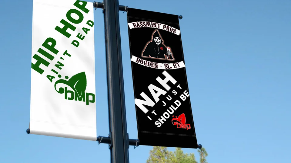
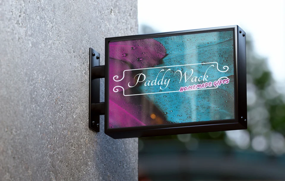
The images on this page come from Galactic's existing portfolio. They illustrate graphic and identity presentation, not claimed West Valley City commissions or installed signage. Use the examples to examine contrast, spacing, and the balance between a business name and its message. A mockup helps visualize an application but does not prove production or campaign performance.
Explore the full portfolio and explain which communication choices seem relevant to your project. A readable heading or strong hierarchy is a useful reference. Another company's story, artwork, or claims should not be treated as interchangeable with yours. The brief should give your own information an appropriate form.
Remote collaboration lets your team review materials where they will be used and contribute practical knowledge. Design can support comprehension and recognition; response also depends on the offer, distribution, audience, and follow-up. We focus the discussion on the information the piece needs to communicate rather than promising a particular number of leads from its appearance.

Make repeated use more reliable
Create a clear distinction between approved artwork and working drafts. Staff and vendors should know which file to use and where to find it. When a service description changes, identify every active piece that carries it rather than updating only the most recent document.
Stable visual rules can make future work easier without forcing every message into one layout. Keep typography, color use, and identity application consistent while allowing different formats to solve different problems. If editable templates are included, agree on which parts staff can change and what needs a design review.
Businesses reaching customers in Taylorsville or Kearns can use the same core identity across their coverage. Those pages provide related Galactic service references. Regional versions of your material should reflect a real difference in audience, service, or logistics, not introduce needless variations that are difficult to maintain.
Questions about graphic design in West Valley City
Can we commission a capability sheet first?
Yes. Define the audience, information, and next step so the piece has a clear job. Identify any supporting web page or technical review it depends on before deciding the schedule.
Will one layout work for print and social media?
The visual direction can connect them, but different dimensions and reading conditions usually require adaptation. List the intended formats in the scope so each receives the review it needs.
Who checks technical claims in the material?
Your business should identify an appropriate factual reviewer. Design can organize and clarify approved information, but it should not introduce unsupported specifications, qualifications, or claims about performance.
Can our team edit the files afterward?
Discuss editable deliverables and the software your team uses. Production files and reusable templates serve different purposes, and third-party fonts or images may have licensing requirements that need clarification.
What affects the cost of a graphics project?
Content readiness, concept exploration, format count, variations, and revision needs influence effort. Printing, delivery, and other production services should be described separately where applicable so estimates can be compared fairly.
A practical next step
Give the next conversation a stronger supporting piece.
Bring the information, audience, and intended format. We can discuss the design and production preparation that will help the piece do its job. Explore our other West Valley City web and design services when the work needs to connect across channels.
Plan your West Valley City project