
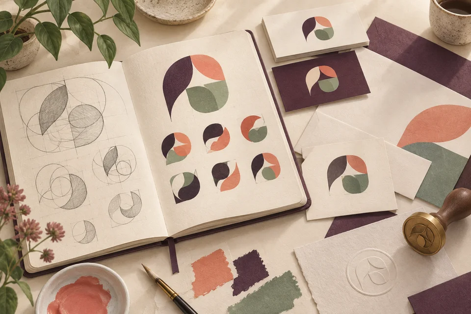
Make recognition consistent from one contact to the next
A business identity needs to work beyond the first impression. Customers should recognize the same company on an initial page, a welcome document, a reminder, and a later proposal. Galactic develops logos for businesses serving Clover Creek with that continuity in mind, considering the name, visual character, and everyday applications together.
Clover Creek names both a Pierce County community and a waterway. A business can use geographic language without turning its identity into a literal creek illustration or suggesting a conservation or public-agency affiliation. We discuss whether a local reference contributes to recognition and where it belongs. The mark should communicate the business's own identity clearly, even when it appears outside the immediate area.
Establish what customers already recognize
An existing identity may contain useful recognition even when the artwork is inconsistent. A name treatment, color, or simple shape can be worth preserving. We examine whether the difficulty is the visual direction itself or the quality and availability of the files. Refinement and reconstruction are different tasks from creating an entirely new identity, and the scope should reflect that distinction.
For a new business, the brief should describe the service and intended audience in concrete terms. Explain where customers will encounter the mark and what impression it should support. Examples of required applications provide a better basis for decisions than a broad request to make the logo feel more professional without identifying what that means for the business.

Define the core mark and its supporting information
The business name may need several arrangements to work across documents and digital spaces. A horizontal version can suit a page header, while a compact treatment may work better in a profile image. Each should preserve the relationships that make the identity recognizable. We choose variations for actual uses rather than add versions simply to make the delivery package larger.
Taglines and location descriptors need deliberate handling. They can provide useful context in a formal introduction but become unreadable in small applications. Separating optional information from the core identity allows the mark to remain clear. Color and typography also need practical specifications so staff can use related materials consistently without guessing from an image on a screen.
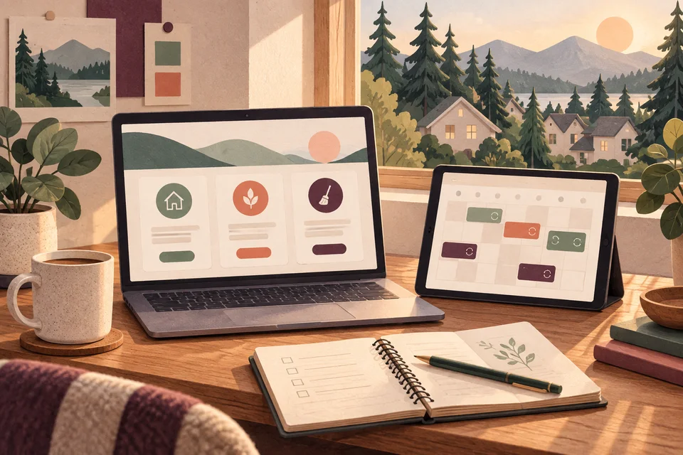
Use a shared brief to compare directions
We gather the approved name, business description, audience, current artwork, and required applications. The brief identifies the qualities the identity should communicate and the constraints it must respect. Concepts then explore meaningful alternatives, with an explanation of how typography, shape, and proportion support the business.
Feedback should address recognition and fit as well as preference. Is the name readable? Does the direction feel appropriate to the service? Is it distinct from other organizations customers may encounter? Those questions help select a direction before refining spacing, color, and the relationship between the name and any symbol.
The selected direction is reviewed across the agreed variations and representative applications. This helps expose weaknesses while changes are still manageable, before final files are prepared or the identity is introduced across the business.
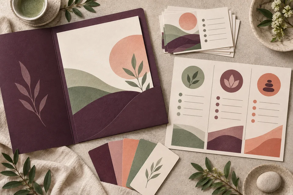
Account for the transition as well as the design
A logo project may include concept development, refinement, variations, and a concise usage reference. Naming, broader messaging, stationery, website updates, and other applications may be separate deliverables. If the identity is changing, list the materials that need updating so the business can plan the rollout rather than discover those costs after approving the mark.
The agreement should clarify final artwork rights, included formats, review rounds, and third-party licenses. Timing depends on an approved name and coordinated feedback from decision makers. Any specialist name or trademark review should be arranged separately and considered before substantial production. Visual design should not be assumed to include a formal clearance process or every application in which the logo might appear.
Check the ordinary uses that reveal weak details
Review the mark in a small mobile header, on a plain printed page, and against the backgrounds the business expects to use. Fine lines and narrow gaps can disappear when reduced. A one-color version helps reveal whether recognition depends too heavily on effects or subtle differences between colors. These checks support an identity that remains useful across everyday conditions.
Specialized production methods may introduce additional requirements. Share known needs from sign makers, printers, or embroidery suppliers early enough to inform the design. A representative application should expose practical constraints rather than hide them in a decorative mockup. The aim is a clear mark and usable files that support the business's real distribution and production needs.

Give the next person clear instructions
A good handoff makes the correct artwork easy to find. Vector formats support appropriate scaling, while transparent raster files are convenient for common digital placements. Reference notes can explain spacing, colors, background choices, and mistakes to avoid. File names should distinguish approved final versions from previews so a small image does not accidentally become the source for all future work.
The Galactic portfolio offers visible examples of identity and application design for discussion. It does not establish Clover Creek client relationships or guarantee a commercial outcome. Clover Creek graphic design can extend the identity into customer materials, and Clover Creek web development can carry it into a clear online introduction. Consistent use across those applications helps preserve recognition as the business produces more work over time.

Questions about logo design in Clover Creek
Can you improve our logo while keeping it familiar?
Yes, when the existing identity has useful elements to preserve. Share the current files and explain what is difficult to use. We can assess whether a refinement, reconstruction, or broader redesign is the appropriate scope.
Should the logo include a creek or clover?
Only if that imagery helps create a distinctive identity for the business. A geographic or word-based reference can be useful, but it should not be automatic. Typography and abstract forms may communicate the intended character more effectively.
Will it work on reminders and small documents?
Small applications should be part of the requirements when they matter to your business. We test readability and may develop a compact variation so the identity remains clear without forcing the full mark into an unsuitable space.
What files are included?
The proposal should specify vector and raster formats, color variations, and usage notes. Tell us about your software and production suppliers so the package supports actual tasks. Specialized requirements should be confirmed rather than assumed.
Can you apply the identity to other materials?
Related applications can be scoped alongside or after the logo. Identify the website, customer documents, and other pieces that need updating. Planning the sequence helps keep the introduction consistent and makes the overall workload clearer.
Related services and nearby areas
Clover Creek web & design services · Clover Creek web development · Clover Creek graphic design · Spanaway services · South Hill services · Galactic portfolio
Plan your next step
Put clearer communication to work.
Tell us what your Clover Creek business needs people to recognize and where its identity must appear. We can plan a logo project that supports a clear introduction, repeated use, and a practical handoff to your team and suppliers.
Discuss your Clover Creek project